The other day I was just casually going about my business, scrolling through my Twitter newsfeed, and suddenly stumbled onto an article about the horns that are growing out of the back of people’s necks from looking down at their phones so much??? So, yeah, this is #2019.
After a solid minute of horrified fascination, I took this info as a positive for my freelance business — which exists solely online. Clearly, people’s attentions are captured by the world wide web; it’s where the eyeballs are, whether it’s desktop, mobile, iPads, Apple Watches — there is even a Kindle that can call people now. It’s the internet’s world and we’re just living in it. I can feel you all collectively sighing like “Kelly, now that you’ve made me palm the back of my neck to check for a horn, please arrive at your point.” So here we go!
If you don’t have a website yet, now is your time. It’s never been easier to create your own tiny slice of space on the ever burgeoning web. A place for you to share your opinions, build out your portfolio, impress those recruiters, start selling your handcrafted products, advertise your services — the list is endless. There’s something so freeing about designing a space that feels completely reflective of you — it’s like an Instagram bio or Hinge profile on steroids (with less pressure and more fun).
Here at Everygirl HQ, we’re big fans of Squarespace for an easy — and beautiful — way to get your portfolio, side hustle, commerce business, you name it, up on the internet in no time flat.
I’ve personally used Squarespace since 2014 (which simultaneously feels like last week and 20 years ago), both for my personal site and working with freelance clients and it seriously never disappoints. Don’t you trust me by now?

So now that we’ve established you definitely need a website, it’s time to determine which template will make your heart sing.
I’m looking to create an online portfolio of my work…
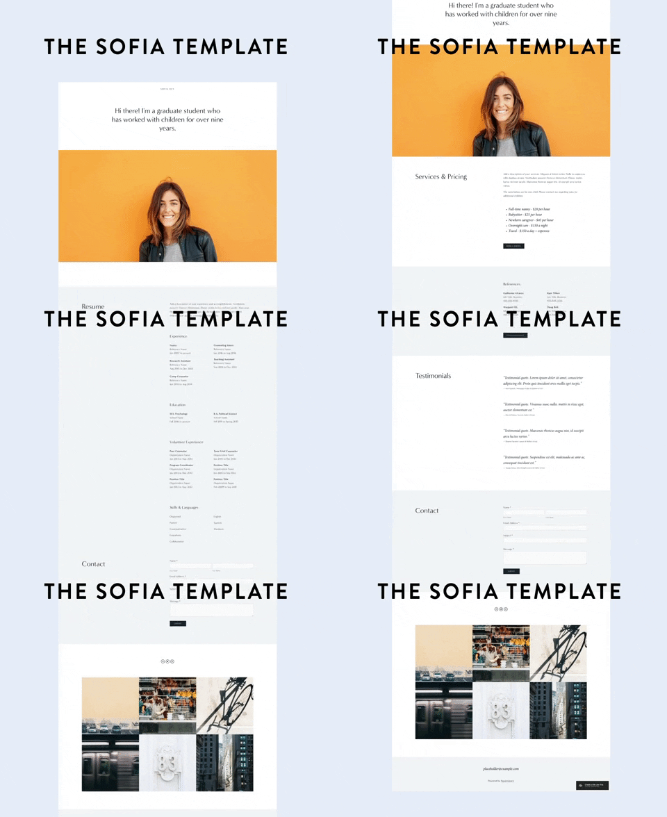
Explore the Sofia template
If you’re currently job hunting, you’ll want a site that is straightforward and easy to navigate (don’t make the recruiters work for it!). Make sure to include your current resume as part of the site AND as a downloadable PDF in case anyone wants to print it off and review. Include a current photo of yourself, your contact information, and (if they are work-appropriate) links to your social channels. Create an “About” page and treat it a bit like a cover letter — this is your place to show off your drive and unique personality.
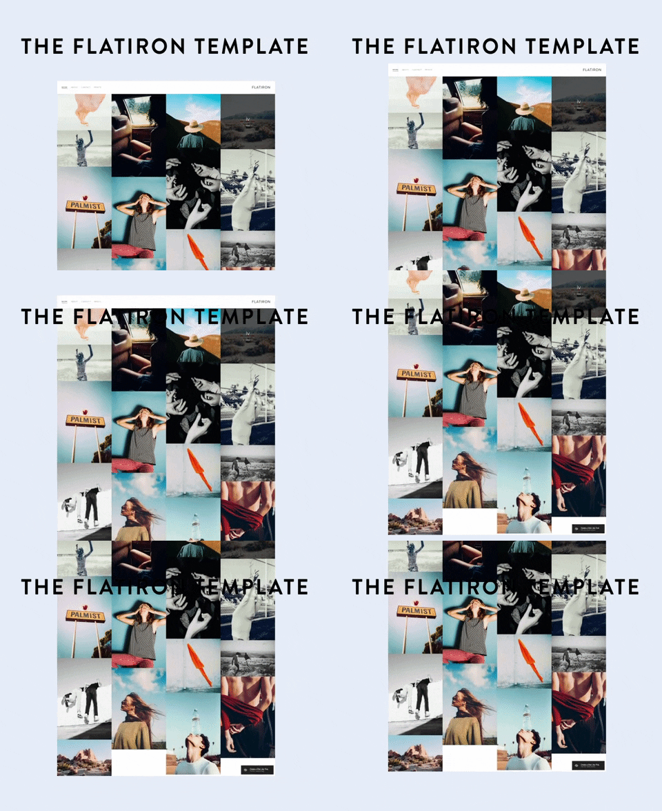
Explore the Flatiron template
If you’re not currently job hunting, but still are curating a collection of your current and previous work, consider a template that puts the work in the spotlight. I’m personally a big fan of the Flatiron template from Squarespace, which displays your work on a homepage with one eye-catching image, and then allows viewers to click through for more information and photos. It’s great if you don’t have a ton of photos for each project, because you really only need one to grab attention enough to click.
I’m ready to start my blog…
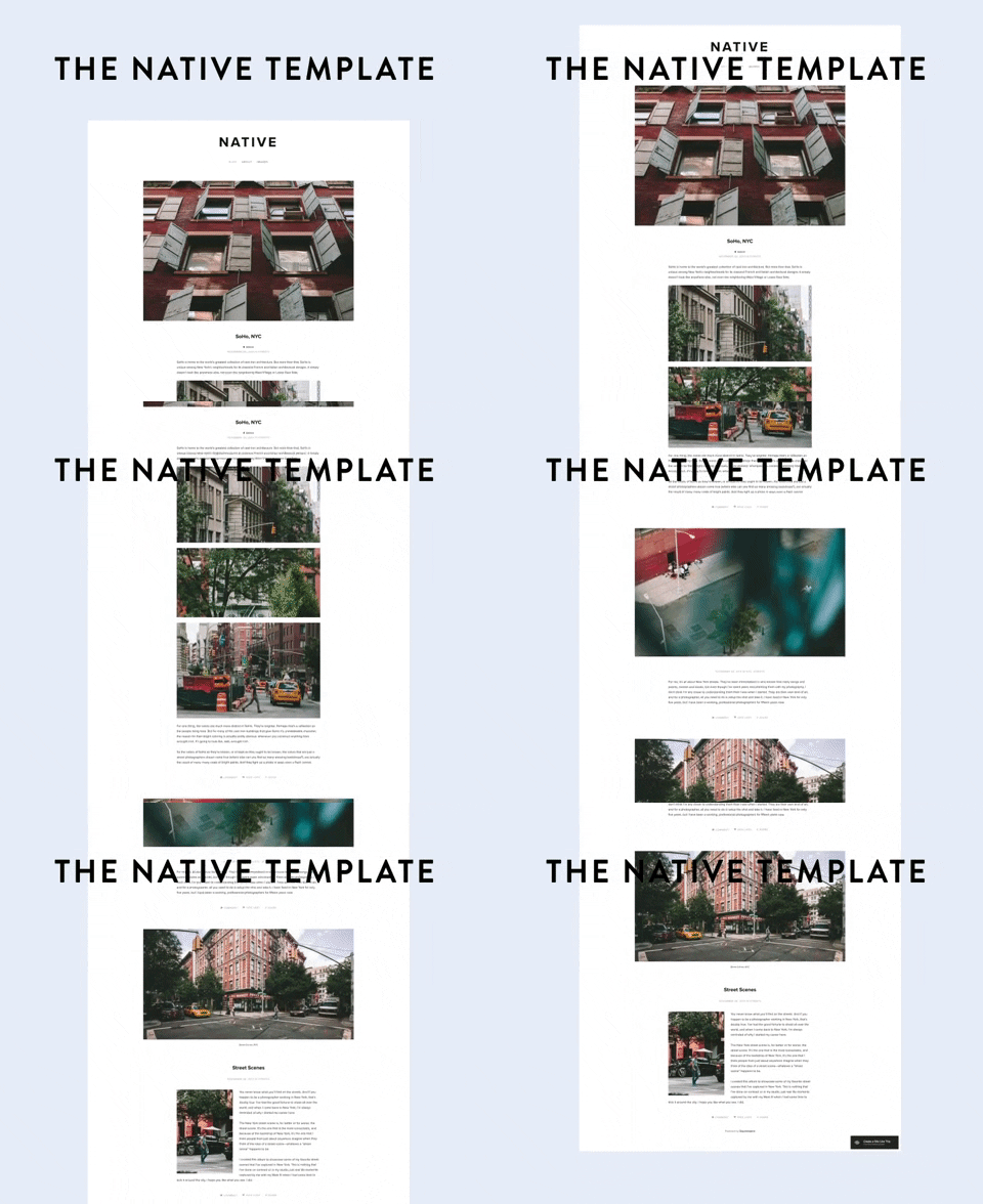
Explore the Native template
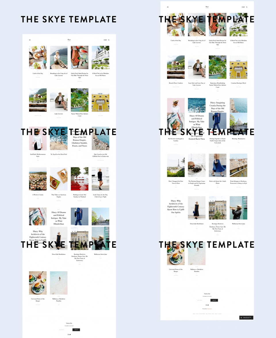
Explore the Skye template
I love the detail that a blog allows — from long-form writing to more instructional how-to’s to more room for photos and captions. It’s a great place to expand on ideas you share on social media and create a place where you can post all kinds of different content. Squarespace has several specialized blog templates for whatever you’re focusing on. I personally love the minimalism of Native (one of their original templates!) and the classic structure of Skye. Our comprehensive guide is the perfect thing to get you started. Plus, how to take amazing photos for your site (with just an iPhone).
It’s time to take my business online…
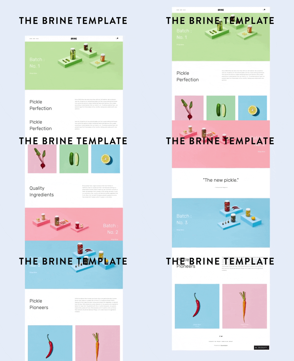
Explore the Brine template
My No. 1 favorite Squarespace template to use for clients is Brine — I find it has the most customization options and is easy to create something completely unique that looks great on desktop, mobile, and tablets. The demo site really screams “Pickles!” lol, but I promise: it’s a great bet for selling anything online. Not sure where to start? Get inspired by these three shop owners who took their business online with Squarespace.
I’m getting married…
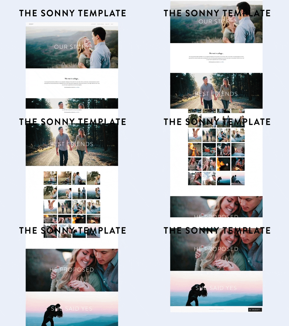
Explore the Sonny template
Every. Single. Time. I am in a wedding (#notmarriedwhatup), I immediately go to the wedding website and get all the deets. What’s the route I will take to arrive? Where’s the registry? Who is in the wedding party? It’s great to have all this information in an easily accessible format for your guests. You’ll answer WAY less off-the-cuff questions (“can you send me that registry link again??”) and it’s also just a fun way to post some cute pics of you and your S.O. — win, win. Need a little inspiration? Three of our editors spilled on how they made their wedding sites and the things you definitely need to include.
I’m looking to start a website just for fun…
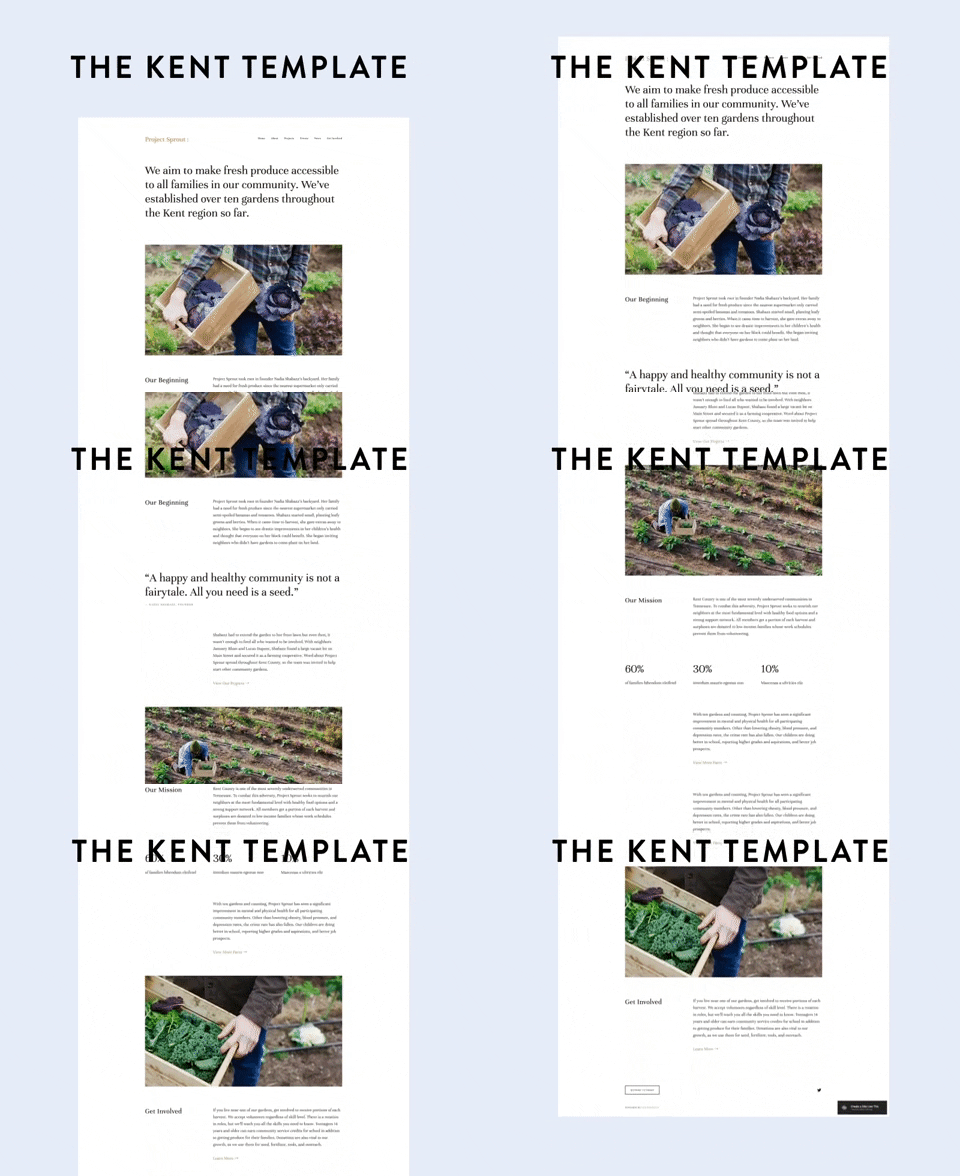
Explore the Kent template
Whether you’re exploring a hobby or dipping your toe into the side-hustle pool, getting online is a great first step for creating and cultivating an audience while giving yourself a creative outlet. If you’re not sure where to start, I recommend the Kent template — it’s super clean and pretty much ready for you to drag-n’-drop your content and photos in — allowing you to worry less about making customizations at first and focus on where you want your content to go. It is king, after all.

This post was in partnership with Squarespace, but all of the opinions within are those of The Everygirl editorial board.
Source: http://theeverygirl.com/category/career-finance/life-work-skills/feed


