Raise your hand if you’ve ever had a near breakdown while trying to take a photo.
Me too, friend. But NEVER FEAR. Taking a good photo for your website doesn’t have to leave you in tears and doesn’t require a shmancy camera or expensive lighting equipment. All you need is a relatively cloudless day, your smartphone, and a taste for adventure. We outline each of the steps to taking a wow-worthy photo below, plus we’ve got a special offer if you’re ready to up your website game. Hey, you’re going to need something to beautifully showcase your images, amiright?
Step One: Assess Your Website Needs

Source: Tudor Template from Squarespace
Before you pick up your phone, you’ll want to start thinking about what kind of photography you actually need. If you’re starting from scratch, choose a website template and gather the information you’ll need on your site before you start thinking about photography. Channel your inner organization goddess and make a list of your site goals. How can the photography enhance these objectives?
Remember, your website is primarily an information machine — whether you’re blogging, advertising your products, creating a portfolio — your audience is visiting your website to find out more about you, to read your latest post, to consider hiring you, etc. Photography plays a hugely important part, but you want it to complement the information presented, not overshadow the purpose of your site or confuse your viewer. And you definitely don’t want to spend a lot of time taking meticulously styled photos in natural light, only to discover that they don’t work when cropped to the size you need for the top banner of your site or they don’t match the overall look of the rest of your content.
If you’re a freelancer, consider…
- Flatlays of your recent projects
- Stylized shots of your workspace
- A headshot
If you’re selling products, consider…
- Shots of your inventory from multiple angles, preferably on white or light-colored backgrounds
- Stylized shots of your products in use. Be sure to book models (or friends) if you’ll need them!
If you’re a blogger, consider…
- Shots with your face. Try a tripod with a phone attachment to snap full-length photos yourself.
- Consider the placement of text over photos (for blog feature images, etc.). Will you need photos with a lot of negative space at the top or bottom?
READ: How to Choose the Right Template for Your Website or Blog
Step Two: Gather Your Supplies

Source: Allyson Trammell for The Everygirl
The next time you see a flatlay consider what’s in the actual photo. It’s not just an open computer or a notepad. There’s a gold pen, a pair of artfully draped glasses, a cup of freshly-brewed coffee, a vase of blooming flowers, all of the above… you get the gist. The point is styling a photo means you’ll need a few props on hand to swap in and out and to fill out your photos and help make the final shots as website-worthy as possible. Having a lot of prop options on hand will also ensure that you can easily make adjustments as you’re shooting, which will save you time and sanity. Win, win!
Start by gathering anything you have on hand that makes sense for your brand and color palette. This could be everything from desk accessories to outfit options (if you’re taking headshots) to solid-colored backdrops. You can also cut out things later. Have you seen those flatlays with tiny little scissors or just leaves scattered across a bed? Nothing is too weird. Fill in anything you’re missing and have everything ready to go before you start shooting.
This is also the time to buy/grab anything extra you might need like a tripod or photo backdrops (hint: try a cheap white posterboard or a white sheet!) or a remote timer if you’re taking photos of yourself by yourself (we all know the struggles of the someone-else-is-taking-my-photo-so-I’ll-do-this-crazy-unnatural-smile conundrum).
Step Three: Choose Your Location + Find Your Light

Source: Alaina Kaczmarski for The Everygirl
Now that you know what kind of photos you want on your site and have everything you need at your fingertips, it’s time to figure out the best location and time to shoot. Will you be shooting outside? Does your apartment get a lot of natural light? Will you be posing in different locations — i.e., coffee shops, parks, etc.? Once you nail down the location, you’ll want to choose a time to shoot where the light is the most flattering (so you’ll glow instead of looking like a member of the undead) and shadows won’t obscure things like flatlays or product images.
You probably already know that natural light is highly recommended for beautiful photos that need a minimal amount of editing. But what does “natural light” mean exactly?? It’s become one of those phrases like “aesthetic” that you hear constantly and has subsequently lost all meaning.
For our purposes, natural light means non-artificial — i.e., no lamps or lightbulbs. Does your apartment have huge windows? Turn off all the lights and clear a space close to a window. Try taking photos at different points of the day and angles to see the difference in the diffusion of light, length of shadows, backlighting, etc. Natural light is usually best at two times of the day:
Blue Hour — the window of time before the sun goes up or after it goes down where the sky is still colorful, but the sun itself is no longer visible.
Magic Hour / Golden Hour — the hour leading up to sunset or just after sunrise
Step Four: Frame Your Shot + Take the Photo

Source: Allyson Trammell for The Everygirl
YOU MADE IT. You’re finally ready to spread your wings and shoot your shot. When you’re framing your photo, first consider the amount of negative space.
Negative Space — the space around and between the subject of an image
In general, you want negative space around your image to ensure it doesn’t feel cramped (i.e., leave room above the subjects head) and you can always go in and crop the photo later. Try placing the subject in different areas of your image and experiment with more or less negative space. When I’m shooting for my website, I always like to leave extra negative space in case I need to crop an image to fit in a vertical banner or if I want to have text superimposed over a certain part of an image.
When you’re ready to take your photo, ensure that the camera lens on your phone is clean and free of smudges/floating fingers. Hold your hand as steady as possible to take the shot, or use your tripod. Review the photos as you go and get a variety of different angles while you have everything setup. I always take about one billion photos at this point and you know what, I’ve never said “whoops too many.” It also takes a while to get into the groove of it, so don’t beat yourself up if you don’t like the photo on the first take.
The great thing about shooting with an iPhone or smartphone is that you can easily and intuitively adjust things like depth of field and exposure on screen as you shoot (no complicated buttons or weird settings to contend with).
Quick Tips:
- Try Portrait Mode for a blurred background effect (can be used with people or objects as long as they are placed in the forefront of the shot)
- To adjust the exposure before you shoot, tap the screen until you see a yellow box appear with a sun icon. Make sure you tap where you want the light to focus. Next, drag your finger up or down to increase or decrease the amount of light.
- Turn off your flash (no seriously, turn off your flash)
- Try turning on the grid to help you balance elements inside of the frame. To turn on a camera grid on your iPhone, navigate to settings, choose “Camera” and then toggle on “Grid.”
Step Five: Edit Your Photo

Source: Danielle Moss for The Everygirl
Okay, don’t panic. Now that you’ve finally clicked that shutter, you might be stressing about your photo not looking as great as you’d like it to… and that’s where editing swoops in to save the day. Because you can’t always engineer the perfect lighting or the exact right placement that missing that plug in the background.
Editing is a delicate balance. You want to gently boost your photo without overediting it to the point where it stops looking like a photo and starts looking like a Seurat painting. Here are the essential edits to know:
Exposure — Increasing the exposure will give you a brighter, whiter looking photo. If your image is looking a little dark or lackluster, try boosting the exposure a touch. Don’t go too far or you’ll overexpose the photo and lose the dimension and necessary shadows.
Contrast — Boosting your contrast will give you slightly sharper lines and more rich, intense blacks. A great option for adding a bit more depth to your photo.
Saturation — If your photo has a yellowish tint, try decreasing the saturation to pull out some of those tones and restore a more neutral cast to the picture.

Source: @kellyetz
Crop — I love a good crop and how it can instantly change the feeling and mood of a photo. You always have the option to crop, which is why it’s great to get as many shots and angles as possible while you’re shooting so that you have a lot of choices to pull from when deciding where to crop.
Size — You’ll want to ensure your photo is resized to perform optimally on your website. Raw photos directly from your phone are usually anywhere from 2,500 to 3,500 pixels wide, which will load realllllly slowly on a site. Resize your photos according to where you’ll be adding them to your site. Banner images should be around 1,200 to 2,000 pixels wide and regular images on your site should be anywhere from 400 to 1,000 pixels wide. If you’re using Squarespace, it does some of this work for you by automatically creating different sizes of a high-quality image when you upload it. Less work = more time sipping wine. Score. More on formatting images for the web here.
You can make a lot of edits directly in the photo app on your phone, but if you’re looking to get a little fancy, our favorite photo editing apps here at The Everygirl office are VSCO, Snapseed, and Lightroom.
The Step Six: Upload Your Photo to Your Site!
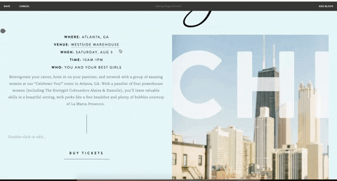
*Applause* If you made it here, give yourself a pat on the back because you just art directed, shot, and edited a photo for your website… all by yourself with just your phone. Now that your photo is edited and ready, it’s time to upload it to your site and make sure everything looks good before you hit publish.

Here is where I like to take everything to the next level (classic Kelly) by adding some subtle animations and hover effects to create a user experience for my website viewers. Luckily, Squarespace makes this easy to do with ZERO CODE (bless). Add animations (like a soft fade up or a sharp focus in) using the “Animations” tab under your image block in Squarespace. Add hover effects with just one click to reveal the image title and description on hover.
![]()
This post was in partnership with Squarespace, but all of the opinions within are those of The Everygirl editorial board.
Source: http://theeverygirl.com/category/career-finance/life-work-skills/feed