Job hunting is really the worst sometimes, am I right? You send out resume after resume and more often than not, get completely ghosted. It’s hard to keep your enthusiasm up enough to keep trying and the process can get disheartening, fast. If you’re feeling like your job search is stalled, it’s time to look at your overall submission presentation. There are some strategic things you can do to ensure that you’re in a prime place to get noticed by recruiters and you might be missing the very thing recruiters always look for when hiring: an online portfolio.
Why do you need an online portfolio?
These days, there are a lot of parts of a job submission to account for: your resume, cover letter, references, work samples, a potential skill test, etc. That’s a lot of email attachments stacking up. And I don’t know about you, but any time I’ve tried to search my email for a particular attachment, I end up giving up halfway through because they are unreasonably hard to find. (Searching email is truly the bane of my existence, it’s a whole thing.)
Recruiters have TONS of emails coming in, many for the same position. You want your email to stand out, and if the recruiter wants to come back to your application at any point to follow up with you, you want them to be able to access everything you provided with one easy click. Enter: your online portfolio. You’ll be giving access to everything you want your recruiter or potential employer to see and you have control over how everything is presented. WIN, WIN.
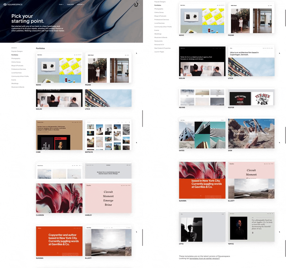
We love to use Squarespace for building out an online portfolio. They even have pre-built templates for exactly this purpose and it’s so easy to use that you’ll have your site up and running within an hour. Several of our editors on staff have a Squarespace site and have used online portfolios when applying for positions. The ability to quickly and easily add all of our work to our portfolio—including plenty of photos—makes (beautifully) highlighting and showing off our best work painless. Needless to say, we’re big fans.

Crafting a compelling “about” page
When building out your online portfolio, start with your “about” page. The page should be a mix of personal and professional information, keeping in mind the culture of the companies you’re applying for. If you’re applying for jobs in a more relaxed sector, be more relaxed with your bio and showcase your personality. If you’re applying in a more conservative sector, be personable but professional.
Resist the urge to chronicle your career path since birth. Remember: recruiters and potential employers are receiving tons of applications. Provide the most compelling, pertinent information, and leave the rest for the interview and resume. Include a headshot or professional photo and links to your social media (if your social media is public and pertains to the position you’re applying for).
I love the personal and CV specific templates available from Squarespace because they make your About page the homepage of your site and it’s incredibly easy to plug-n’-play your information in. How chic does this one I just made look? It took me legitimately 15 minutes to pull together.

Include your updated resume
Be sure to include your most up-to-date resume on your site. Consider listing it out in text and adding it as a downloadable file. Yes, you’ll obviously want to make sure that the companies you’re applying to have a PDF or hard copy of your resume, but including it on your website is a convenient way to allow them to share your information and background with colleagues in the office (without having to search through email or files which, as we’ve established, is hell).
Show off your portfolio of work
An online portfolio isn’t just important for creatives or artists. Including a page that details the big impacts or initiatives you’ve worked on in your previous positions allows employers to see your skills in action, which is invaluable when it comes to gaining their trust. This is also a great value add to a traditional resume, where you sacrifice detail to keep it to one or two pages. On your site, you can be way more detailed; try including photos and data points for different initiatives you’ve been a part of or championed at your previous jobs.
Show off a marketing campaign idea that received a great response or past strategies you created for clients, and pay close attention to the skills your potential employers mention in their job posting. Include some of the written communication you’ve crafted that shows how you fit the bill.
For showcasing your body of work, I like to use the “gallery” blocks in Squarespace. Here, I used a “grid” gallery block to easily upload photos of my work. If you aren’t in an image-based profession (I’m a graphic designer by trade), never fear! Try creating a text-based image (see example below) or use a free stock image, available within Squarespace.


Brag about yourself a little
The best part of your online portfolio is that you get to design the information in exactly the way you want it presented, without the constraints of a traditional resume or cover letter. It would be a great place to include photos or information about clubs you’re a part of, volunteering you’ve undertaken, causes you care about, blogs you’ve written, press you’ve received, references or testimonials from coworkers or mentors, etc.
Remember when you’re adding information, however, to always circle back to the job listings you’re applying for. What buzzwords are included in the postings? What do the companies seem to value? Make sure your site is both a reflection of you and the position you are throwing your hat in the ring for.

This post was in partnership with Squarespace, but all of the opinions within are those of The Everygirl editorial board.


